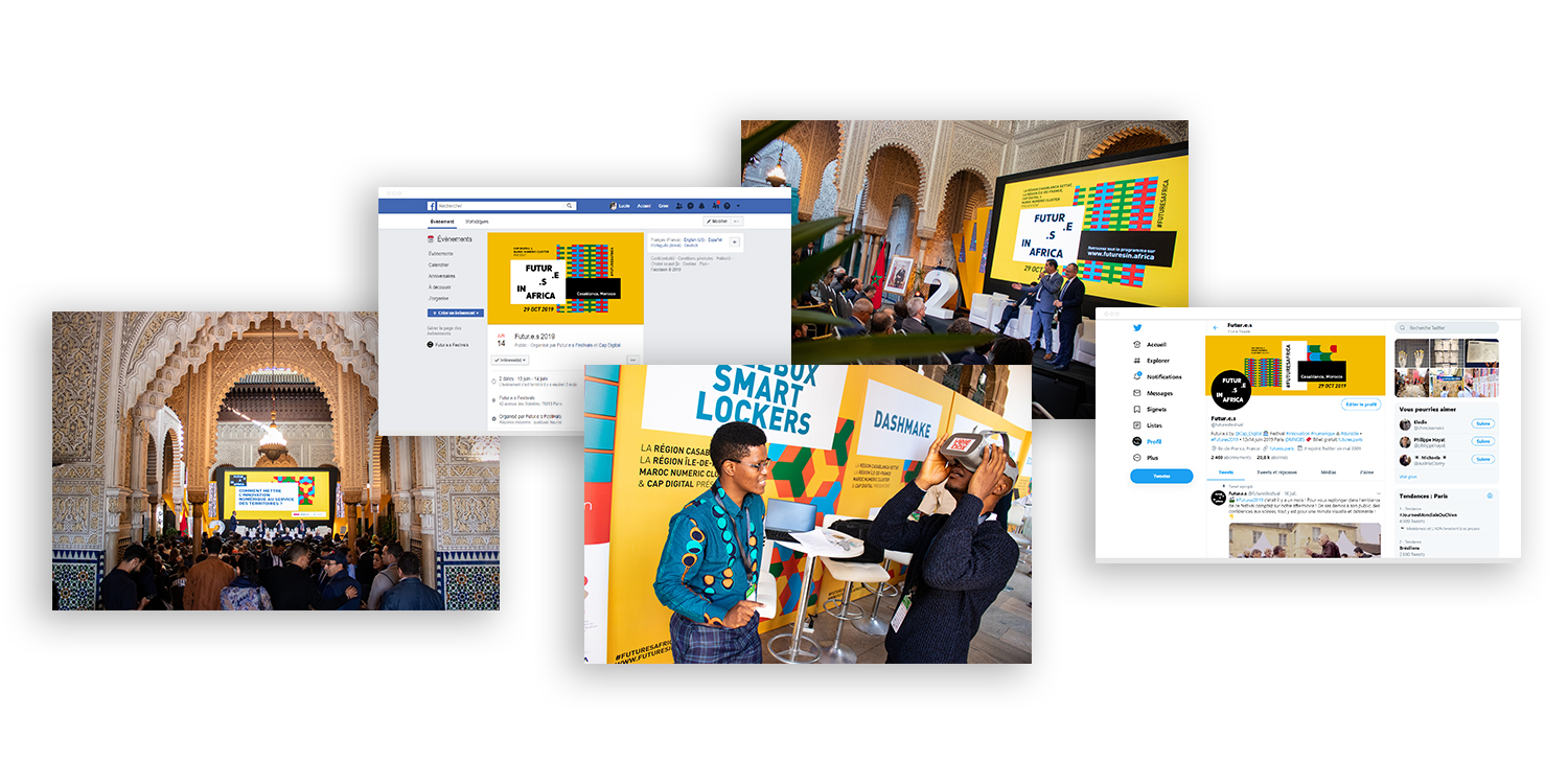
Futur.e.s in Africa 2019
Y.O.L.O. bike
CLIENT
Cap Digital, in the context of the Futur.e.s festival
ROLE
art direction, graphic design, UX/UI design, Wordpress
TECHNOLOGY & TOOLS
Illustrator, Indesign, Wordpress, HTML/CSS
DESIGN BRIEF
For already 10 years, Futur.e.s is one of the most important event about technology and sustainability in France and Europe. Since 2018, they collaborate with Morocco in order to create Futur.e.s in Africa, an event dedicated to the challenges of sustainable and inclusive territories on the African continent. Agriculture, mobility, water, energy and waste management, access to education... the event gathers the most innovative solutions brought by companies, universities and institutions, emerging start-up or associations, for the benefit of territories and citizens. For their second edition, they needed a refonte of their brand identity & consequently some new web & print assets as well as a new website. While bringing the identity up to date, the challenge was to set in the event keeping the consistency over years to strenghten its brand and also to signify the connection with the French edition.
THE PROJECT
In order to bring a complete & evolutive solution, I designed an modular identity, based on the previous year edition's colours, hightlighting Africa's different territories and cultures. This way, it could be easily adaptable on any material : poster, scenography, social networks visuals, keynote... The website, also using this modular system, was designed in order to bring the right information at the right moment (before/during/after the event) to the visitor. I made it multilangual and responsive, once again, so it could adapt to any situation. I delivered a ready-to-use solution to the client with a detailed style guide as well as a website userguide to allow anyone in the French or the Moroccan festival team be on the same page despite the distance but also to let the future teams of the next editions take the project back.
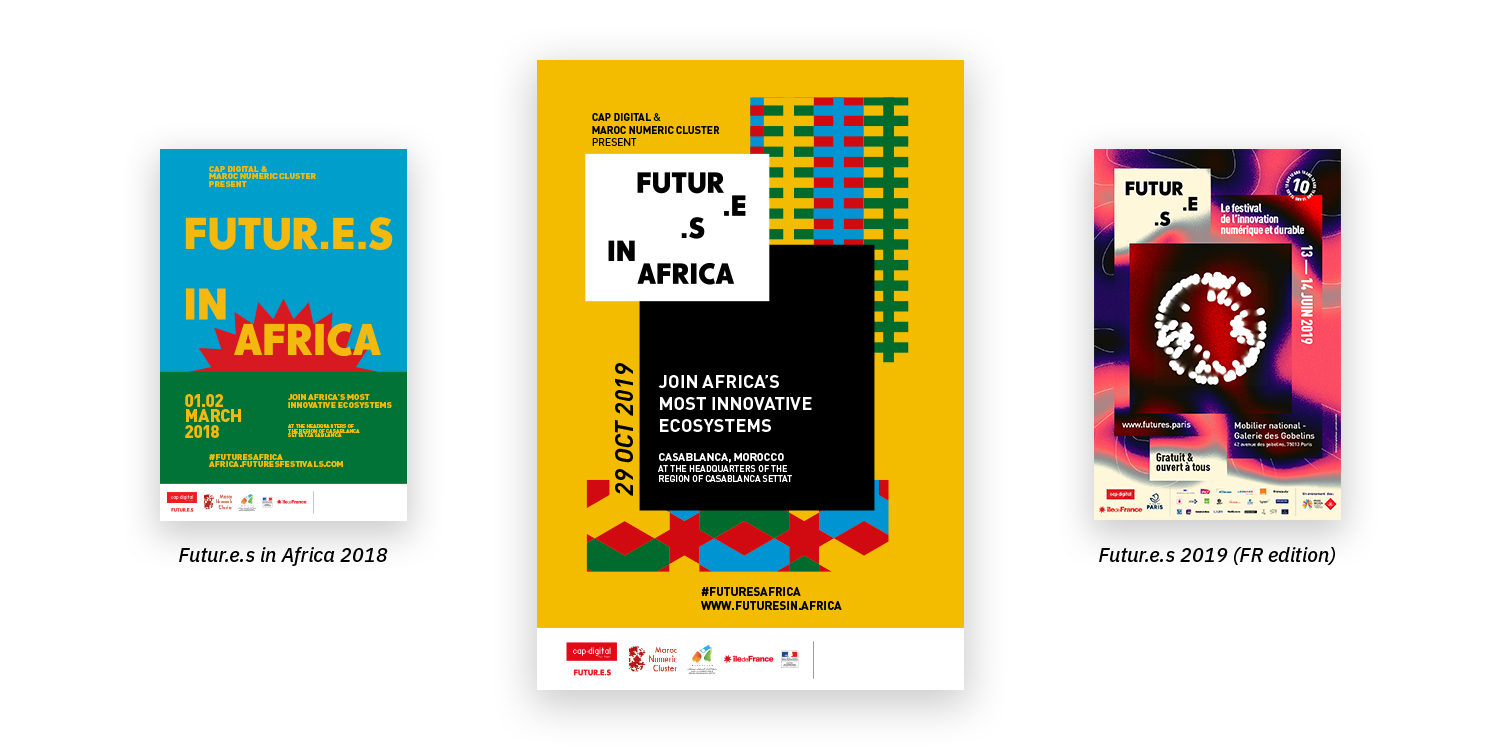
MODULAR PATTERNS TO ILLUSTRATE THE TERRITORIES
2018's identity was using 4 colours picked among the African flags. In order to be consistent with the previous year's edition, and as a first step to illustrate the theme "Sustainable and inclusive territories on the African continent", I decided to keep this color combination. I designed several patterns with them, in the style of a geographical or topographical legend, made to illustrate the different cultures and territories that make Africa, like Northern Africa inspired by its Moorish tiles or Western Africa represented by its Wax prints. I thought about a composition system that consists in overlaying these patterns with text areas to build a layout. This modularity was a way to symbolize the mixing within the African territory, but also a way to connect with the French edition's identity, also using this kind of layout (see above).
THE WEBSITE : SIMPLE BUT EFFICIENT
The website aimed to be simple but efficient, leading the visitor to the right information at the right time : for example, the description of the event and the subscription form are easily reachable for anyone going on the website before the event. On the otherside, I've built the mobile navigation around the timeline so visitors could quickly find their way during the event. The technical challenge of this website was to gather several functionnalities such as an interactive timeline, animated sliders, forms or RSS feeds management while being responsive and multilingual. Eventually, I had to find solutions on Wordpress to make this content easily editable for the festival team, despite some sophisticated features, so they could autonomously and quickly update the information.

Selected Works
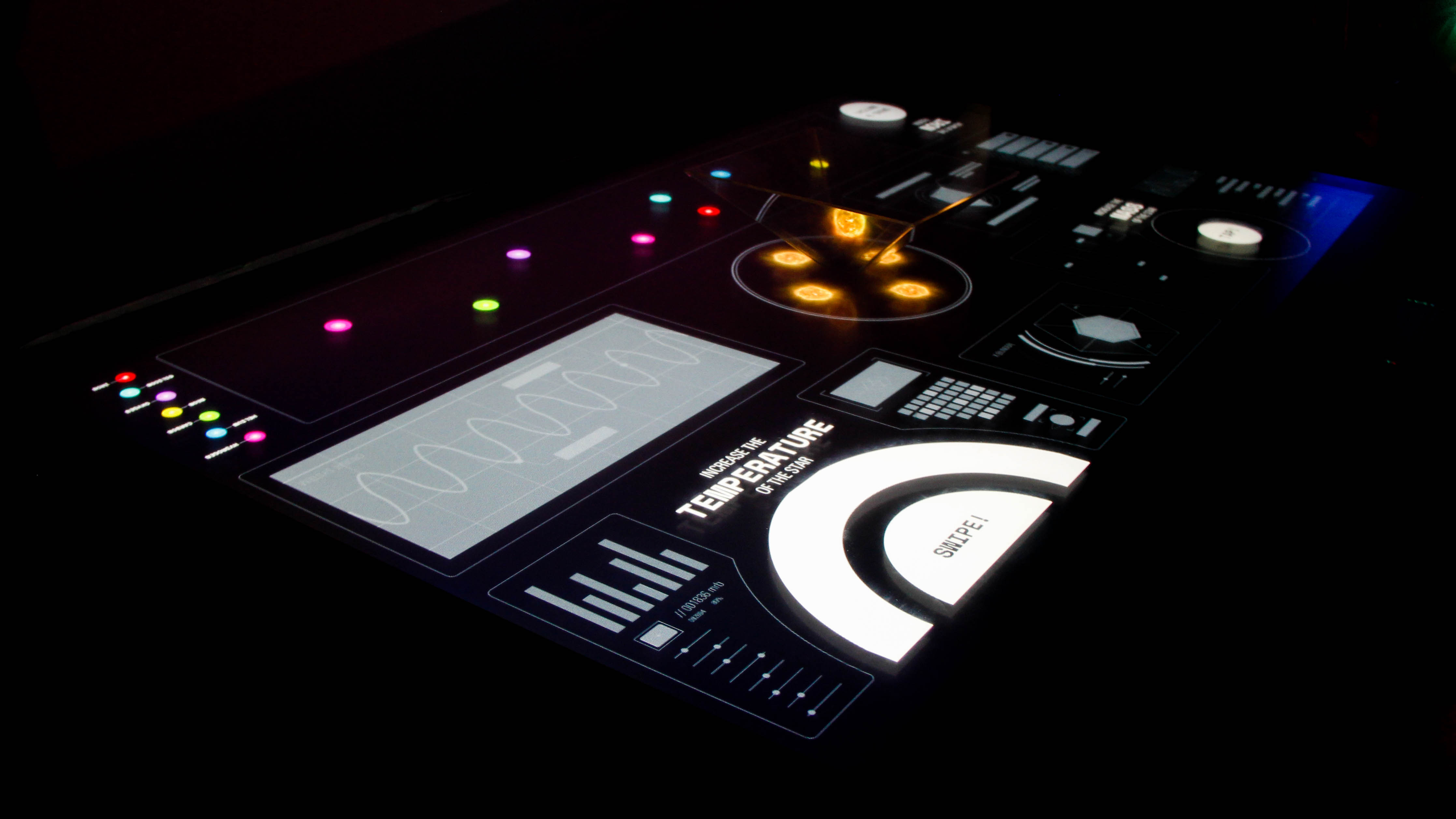
The black hole creatorInstallation
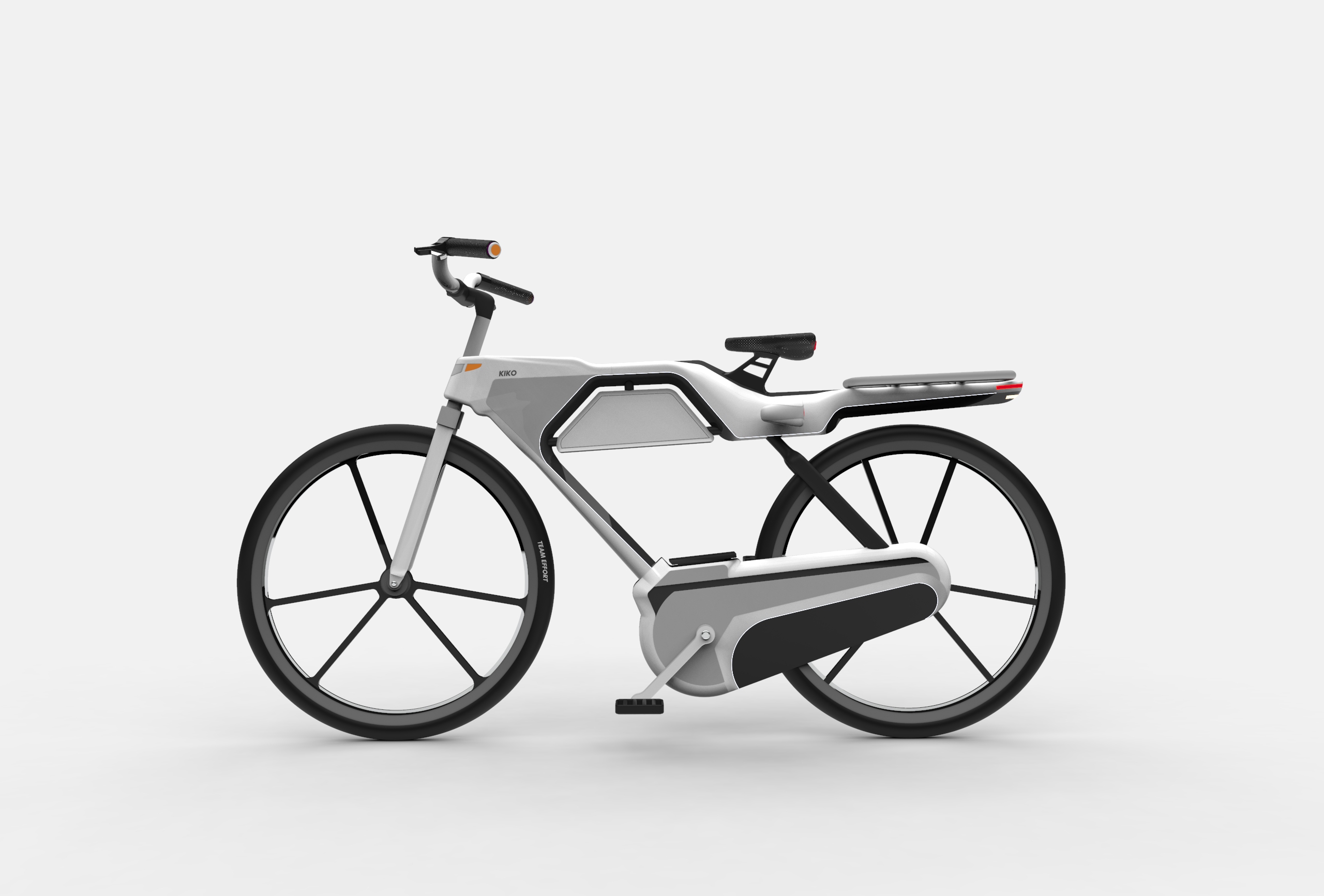
Y.O.L.O. bikeSpeculative design
e.motionInstallation
MélothesieInstallation
